The following materials are modified from the tmap book.
In this lab, we’ll explore the basics of map-making in R using the tmap package.
1. Why tmap?
- There are MANY ways to make maps in R, but
tmapor “thematic maps” offers the most flexibility. tmapcan handle vector and raster objects from thesf,sp,raster, andstarspackages.- The syntax of
tmapis based onggplot2and the Grammar of Graphics tmapsupports static AND interactive maps (yay!)
There are MANY different ways to make maps in R, all with different pros/cons. Check out this resource for examples of what map making looks like in ggplot2, leaflet, and more!
2. Set up
Download the week 1 materials needed for our lab. Upload this folder to your EDS 223 repository, in your Week 1 folder.
Navigate to the
tmap_intro.qmdfile. Follow along with the in class lab and fill out this qmd as you go!
install.packages("sf")
install.packages("stars")
install.packages("tmap")library(sf) # for vector data (more soon!)
library(stars) # for raster data (more soon!)
library(tmap) # for static and interactive maps
library(here)3. Specifying spatial data
Similar to plotting in ggplot2, in order to plot spatial data, at least two aspects need to be specified:
- the spatial data object to plot (similar to
ggplot(data = )) - and the plotting method (similar to
geom_points())
Let’s load three spatial data objects to plot:
- a raster (more on this next week!) of elevations of the world
- a vector dataset (again, more soon!) of country boundaries
- a vector dataset of locations of major cities
# raster of global elevations
world_elevation <- read_stars(here("data","week1","worldelevation.tif"))

# country boundaries
world_vector <- read_sf(here("data","week1","worldvector.gpkg"))

# major cities
world_cities <- read_sf(here("data","week1","worldcities.gpkg"))
Shapes and layers
In tmap, the spatial object to plot needs to be defined within the function tm_shape(). This is analogous to defining the data frame to plot in ggplot2 using ggplot(data = ).
Let’s start by plotting the countries of the world.
# plotting a single spatial object

tm_shape(world_vector) + # defines the spatial object to plot
  tm_polygons() # defines how to plot the object
Shapes hierarchy
Similar to ggplot2, we can plot multiple datasets by adding layers. When multiple spatial objects are being plotted, each has to be defined in a separate tm_shape() call.
Now let’s plot the following two spatial objects:
- countries of the world
- major cities of the world
In the next section we’ll unpack the difference between tm_polygons() and tm_dots(), but for now let’s just pay attention to the syntax of how we plot multiple spatial objects. Each spatial object needs to be specified using tm_shape() followed by a function for how to plot it.
# plotting two spatial objects

tm_shape(world_vector) + # defines the FIRST spatial object to plot
  tm_polygons() + # defines how to plot the FIRST object
tm_shape(world_cities) + # defines the SECOND objet to plot
  tm_dots() # defines how to plot the SECOND object
So far, we’ve only tried plotting vector data (more on what this means next week!), but one of the major advantages of tmap is that it allows us to plot vector and raster on the same map.
Let’s try on example of this by adding information on global elevations to our previous map.
# plotting vector and raster spatial objects

tm_shape(world_elevation) + # plot global elevations
  tm_raster() + # tm_raster for raster data
tm_shape(world_vector) +
  tm_borders() +
tm_shape(world_cities) +
  tm_dots() +
  tm_text("name")
[scale] tm_raster:() the data variable assigned to 'col' contains positive and negative values, so midpoint is set to 0. Set 'midpoint = NA' in 'fill.scale = tm_scale_intervals(<HERE>)' to use all visual values (e.g. colors)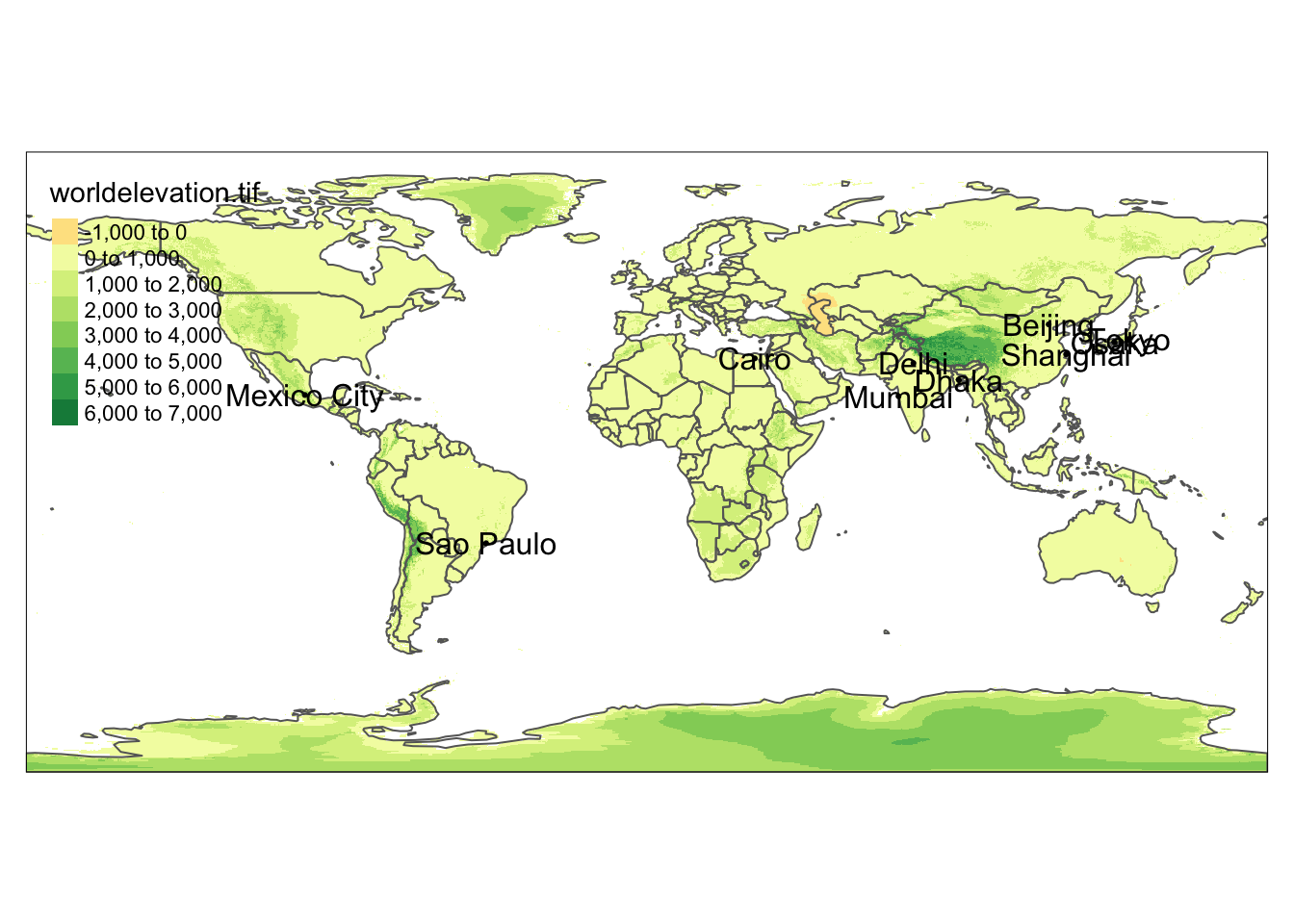
Similar to ggplot2 the order of the “layers” matters! The order in which datasets are plotted defines how they are layered (think of this is as adding layers of paint). Spatial objects have extra features which additionally change this behavior: spatial extent and projection. When creating maps with tmap, whichever dataset is used in the first tm_shape() call sets the spatial extent and projection (more details next week!) for the entire map.
For example, if we swapped the order of tm_shape() calls in the previous example, we’d end up with a different map.
tm_shape(world_cities) + # plot world_cities first
  tm_dots() +
  tm_text("name") +
tm_shape(world_elevation) +
  tm_raster() +
tm_shape(world_vector) +
  tm_borders()
[tip] Consider a suitable map projection, e.g. by adding `+ tm_crs("auto")`.
[scale] tm_raster:() the data variable assigned to 'col' contains positive and negative values, so midpoint is set to 0. Set 'midpoint = NA' in 'fill.scale = tm_scale_intervals(<HERE>)' to use all visual values (e.g. colors)
This message is displayed once per session.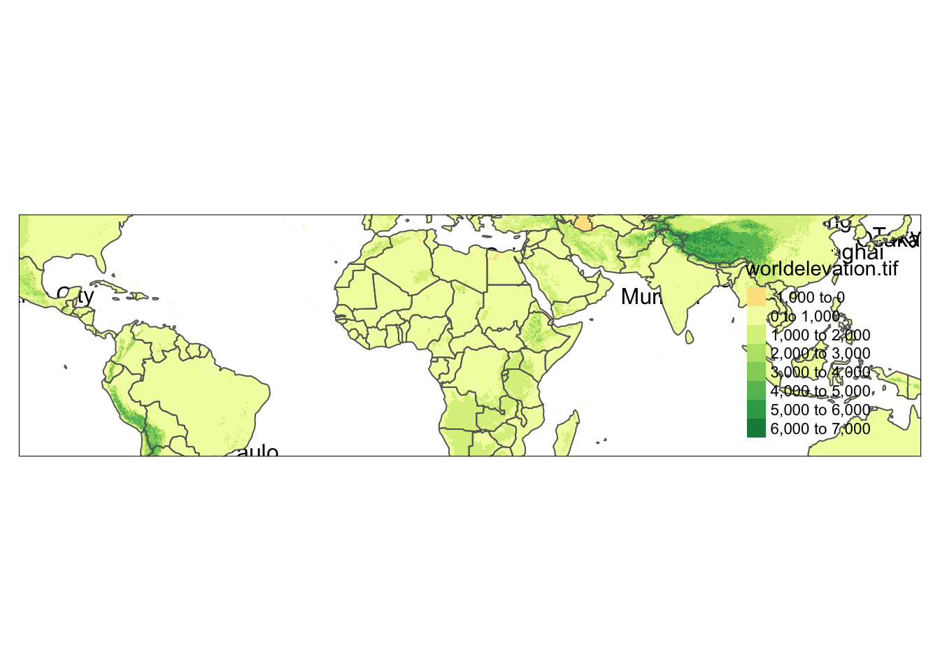
Sometimes this can present sticky issues! Imagine the case where we want to use the spatial extent and projection from the world_cities data, but want it plotted on top of the other datasets. We can do this by changing the main shape using the is.main argument.
tm_shape(world_elevation) +
  tm_raster() +
tm_shape(world_vector) +
  tm_borders() +
tm_shape(world_cities, is.main = TRUE) + # plot world_cities last, but set as main shape
  tm_dots() +
  tm_text("name")
[scale] tm_raster:() the data variable assigned to 'col' contains positive and negative values, so midpoint is set to 0. Set 'midpoint = NA' in 'fill.scale = tm_scale_intervals(<HERE>)' to use all visual values (e.g. colors)
Map extent
One thing to consider when making maps is what area we want to show on the map – the spatial extent of our map. This isn’t an issue when we want to map all of our data (spatial extent of our data matches our desired map extent). But often our data will represent a larger region than what we want to map.
We have two options:
- process our data to create a new spatial object for exactly what we want to map (fine, but annoying)
- change the extent of a map
tmap has a few options for changing the map extent. The first is by defining a bounding box that specifies the minimum and maximum coordinates in the x and y directions that we want to represent. The values need to be in the units of the original data or we can create a bounding box using st_bbox().
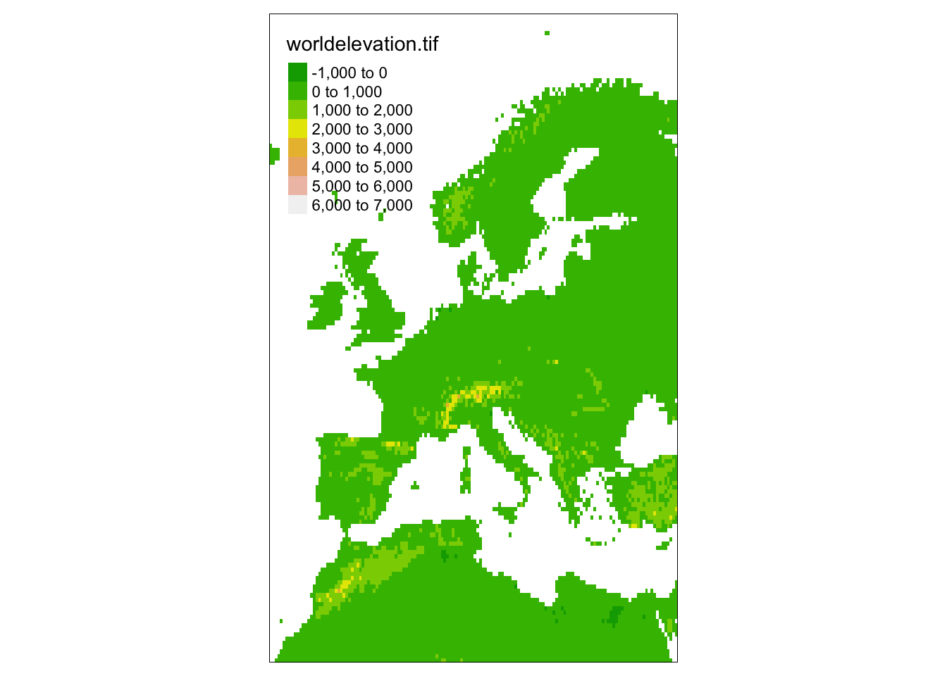
For example, let’s restrict our previous map to just Europe using a set of min/max values.
tm_shape(world_elevation, bbox = c(-15, 35, 45, 65)) + # add bounding box to restrict extent
  tm_raster() +
tm_shape(world_vector) +
  tm_borders()
[scale] tm_raster:() the data variable assigned to 'col' contains positive and negative values, so midpoint is set to 0. Set 'midpoint = NA' in 'fill.scale = tm_scale_intervals(<HERE>)' to use all visual values (e.g. colors)Warning: Current projection unknown. Long lat coordinates (wgs84) assumed.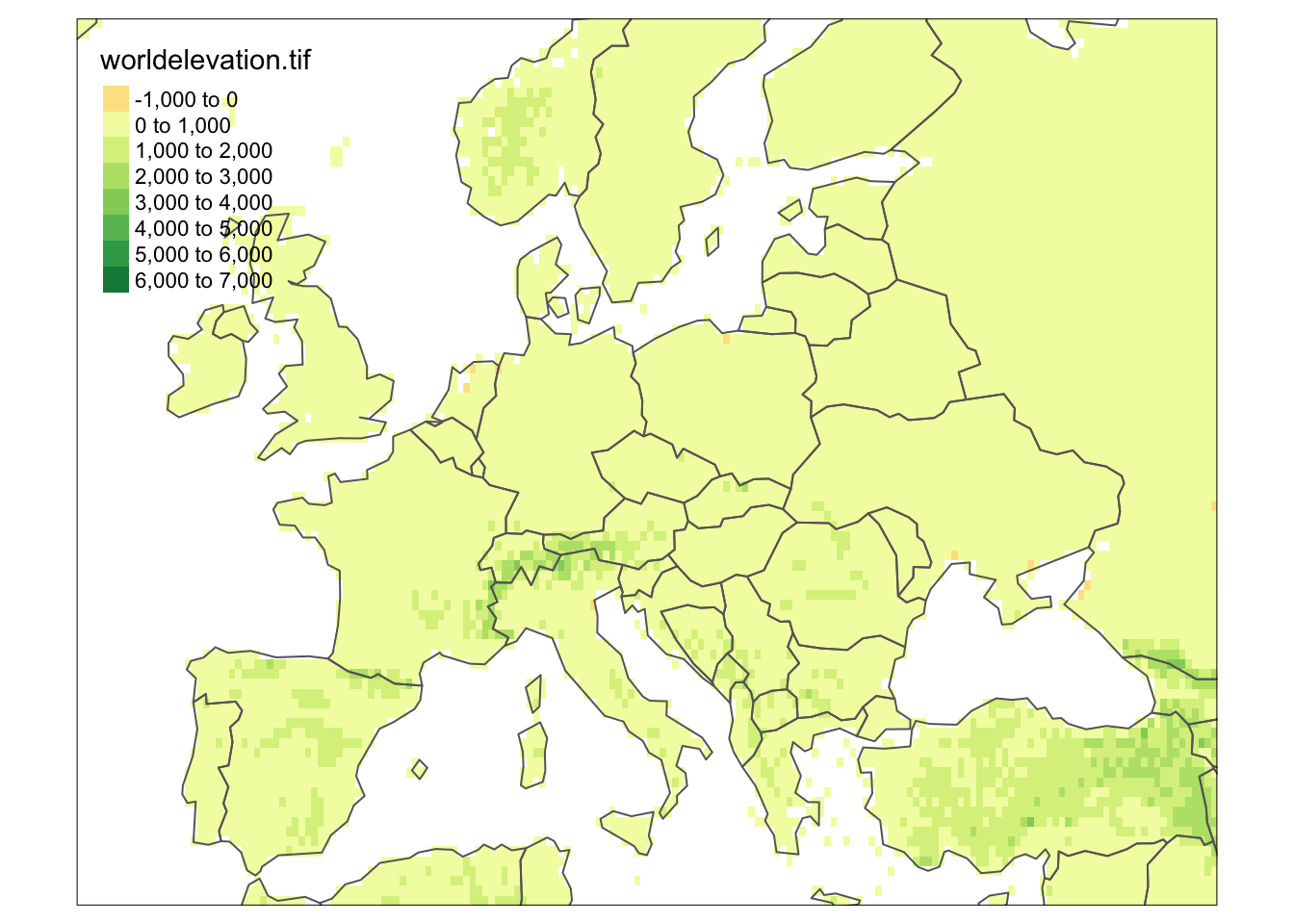
We can also restrict the extent of the map using the extent of a dataset. For example, we can restrict the map using the extent of the world_cities data.
tm_shape(world_elevation, bbox = world_cities) + # bounding box = extent of world_cities
  tm_raster() +
tm_shape(world_vector) +
  tm_borders()
[scale] tm_raster:() the data variable assigned to 'col' contains positive and negative values, so midpoint is set to 0. Set 'midpoint = NA' in 'fill.scale = tm_scale_intervals(<HERE>)' to use all visual values (e.g. colors)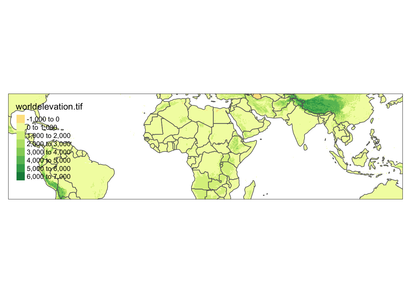
4. Layers
Again following the syntax of ggplot2 which uses layers to plot data (e.g. geom_point()), tmap also uses layers! We’ve already used layers in our previous examples (e.g. tm_borders()), but now we’ll dig into them in more detail. All possible layer types can be found in the table below:
| Function | Element | Geometry |
|---|---|---|
| Basic functions | ||
| tm_polygons() | polygons (borders and fill) | polygons |
| tm_symbols() | symbols | points, polygons, and lines |
| tm_lines() | lines | lines |
| tm_raster() | raster | raster |
| tm_text() | text | points, polygons, and lines |
| tm_basemap() | tile | |
| tm_tiles() | tile | |
| Derived functions | ||
| tm_borders() | polygons (borders) | polygons |
| tm_fill() | polygons (fill) | polygons |
| tm_bubbles() | bubbles | points, polygons, and lines |
| tm_dots() | dots | points, polygons, and lines |
| tm_markers() | marker symbols | points, polygons, and lines |
| tm_square() | squares | points, polygons, and lines |
| tm_iso() | lines with text labels | lines |
| tm_rgb()/tm_rgba() | raster (RGB image) | raster |
Polygons
The main function to visualize polygons is tm_polygons(). By default, it plots the internal area of the polygon in light grey and the polygon borders in slightly darker grey.
tm_shape(world_vector) +
  tm_polygons()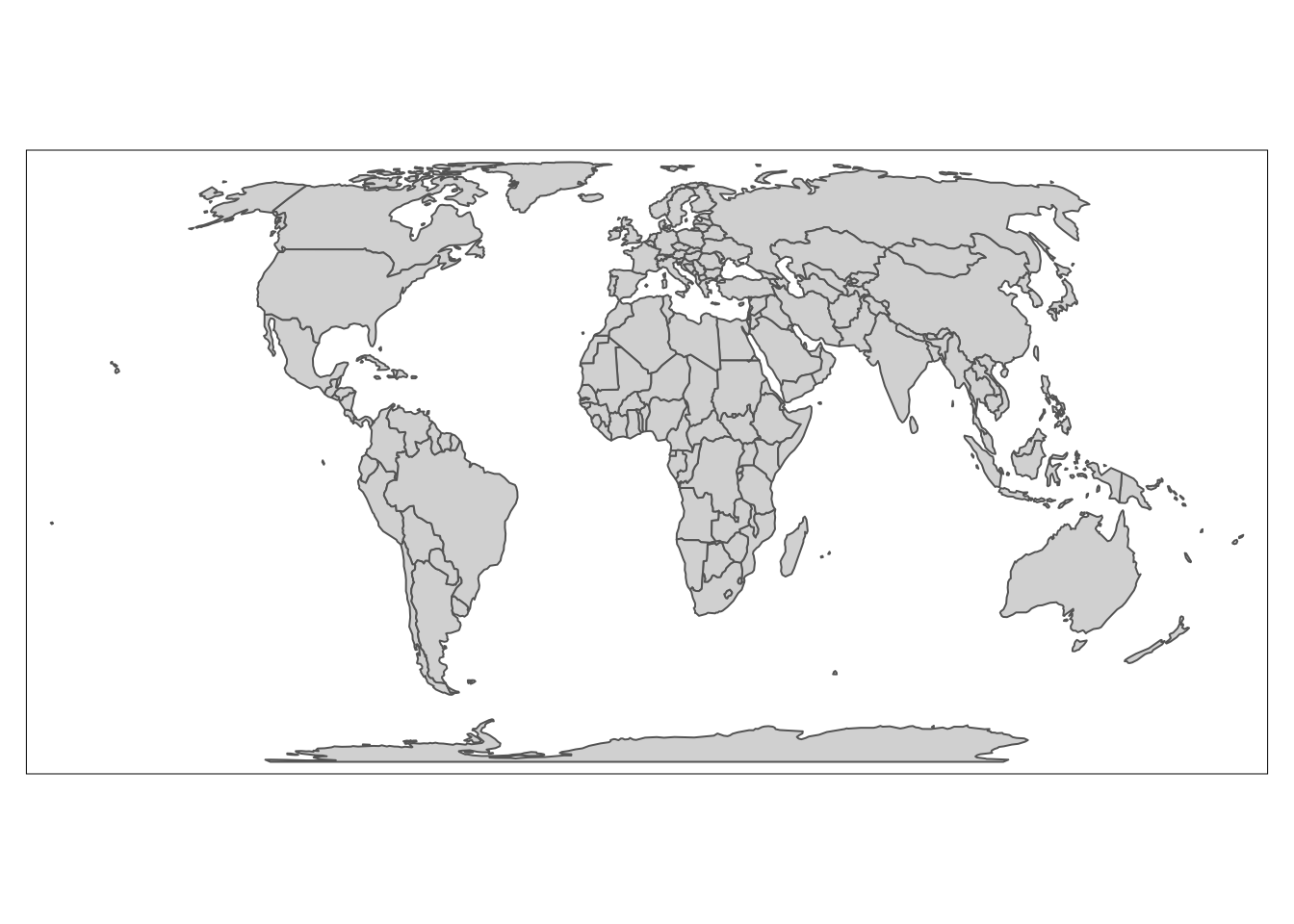
We modify the colors using the fill and col arguments and other arguments borrowed from ggplot2.
tm_shape(world_vector) +
  tm_polygons(fill = "lightblue",
              col = "black",
              lwd = 0.5,
              lty = "dashed")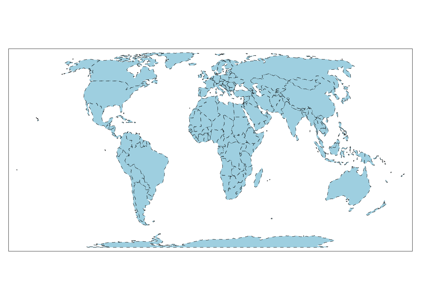
But, you may have noticed in the previous table that tm_polygons isn’t the only function we can use to plot polygon data. In fact, tm_polygons is a combination of two separate functions - tm_fill() and tm_borders().
The tm_borders() function plots just the borders and the tm_fill() function fills polygons with a fixed color or a color palette representing a selected variable.
# plot just borders

tm_shape(world_vector) +
  tm_borders(col = "red")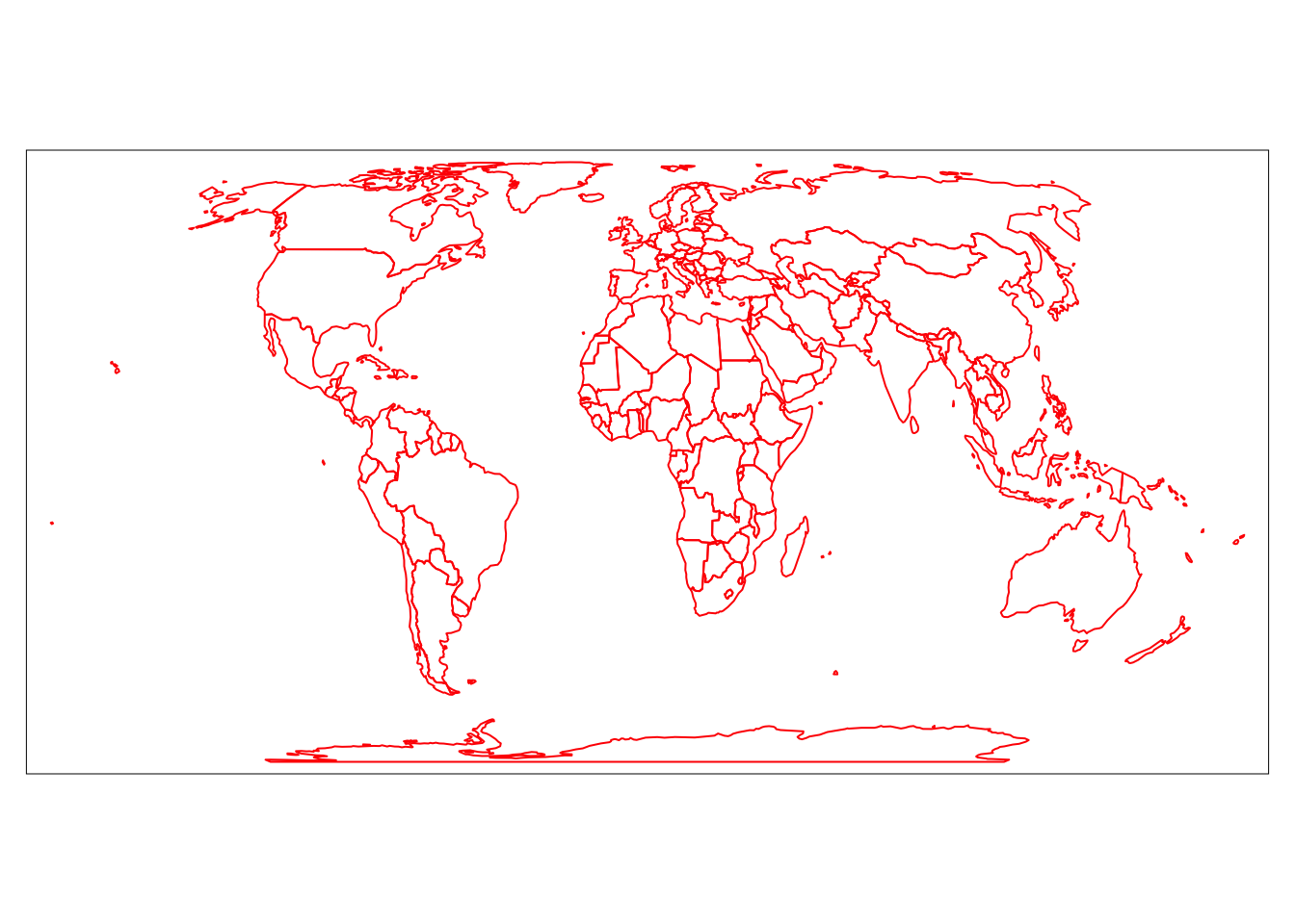
# fill polygons with fixed color

tm_shape(world_vector) +
  tm_fill(fill = "lightblue")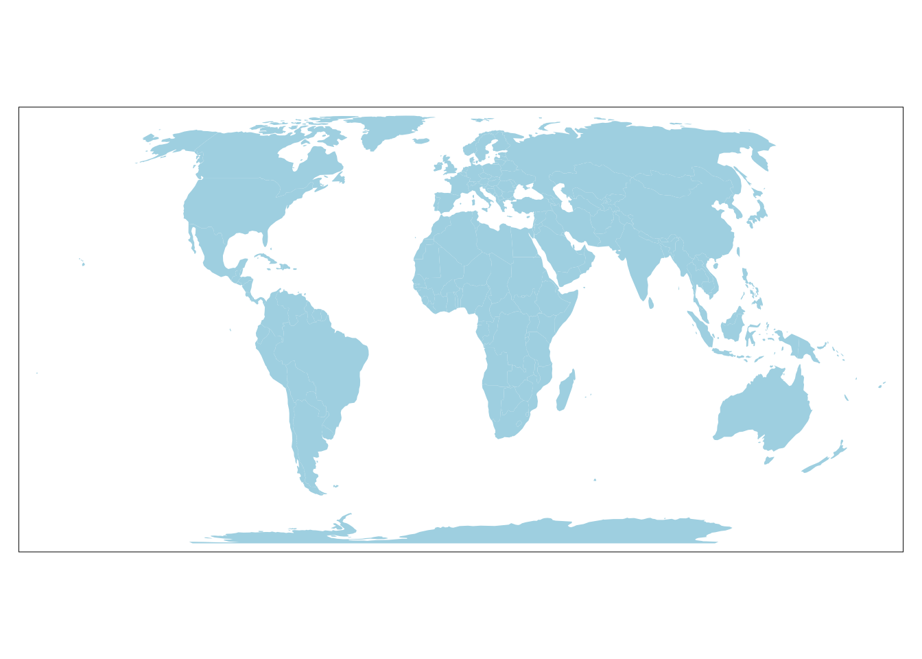
# fill polygons with a color palette representing a variable

tm_shape(world_vector) +
  tm_fill("CO2_emissions")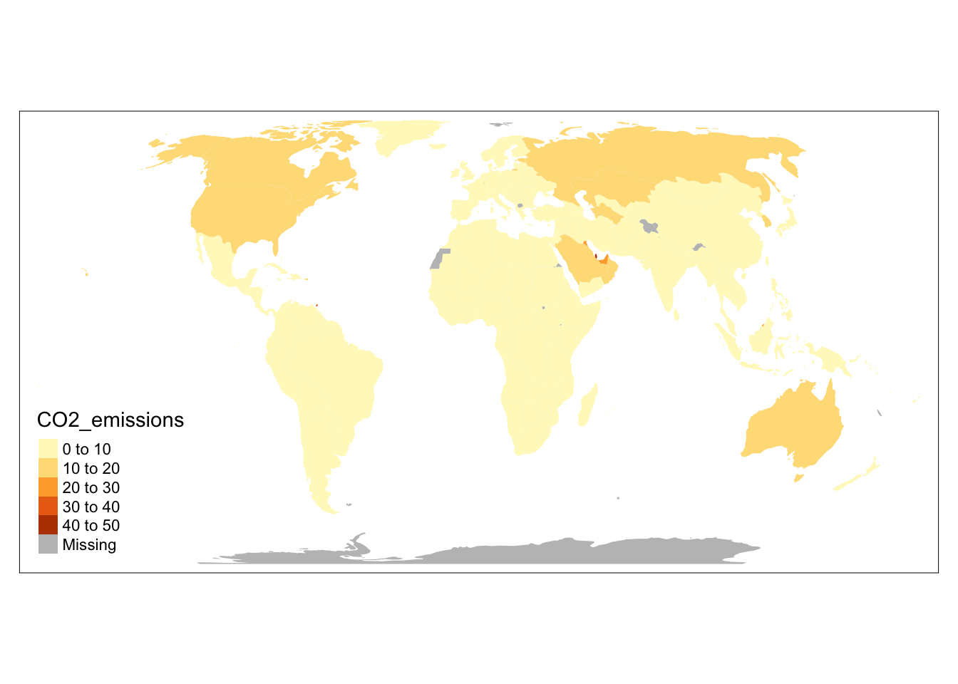
Note that to change the border color in tm_polygons() we used the fill argument, but in tm_borders() we used the col argument. This is necessary in tm_polygons() to differentiate between the settings for the polygons fill and borders.
Symbols
Symbols are a very flexible layer type. They typically represent point data, but can also be used for lines and polygons (in this case located at the centroid of each feature). Symbols are also highly flexible in how they can be visualized. They can show the values of a given variable by the color, size, and shape of the symbol.
tm_symbols() is the main function in tmap to display and modify symbol elements. By default, this function draws a gray circle symbol with a black border for each element of an input feature.
tm_shape(world_cities) +
  tm_symbols()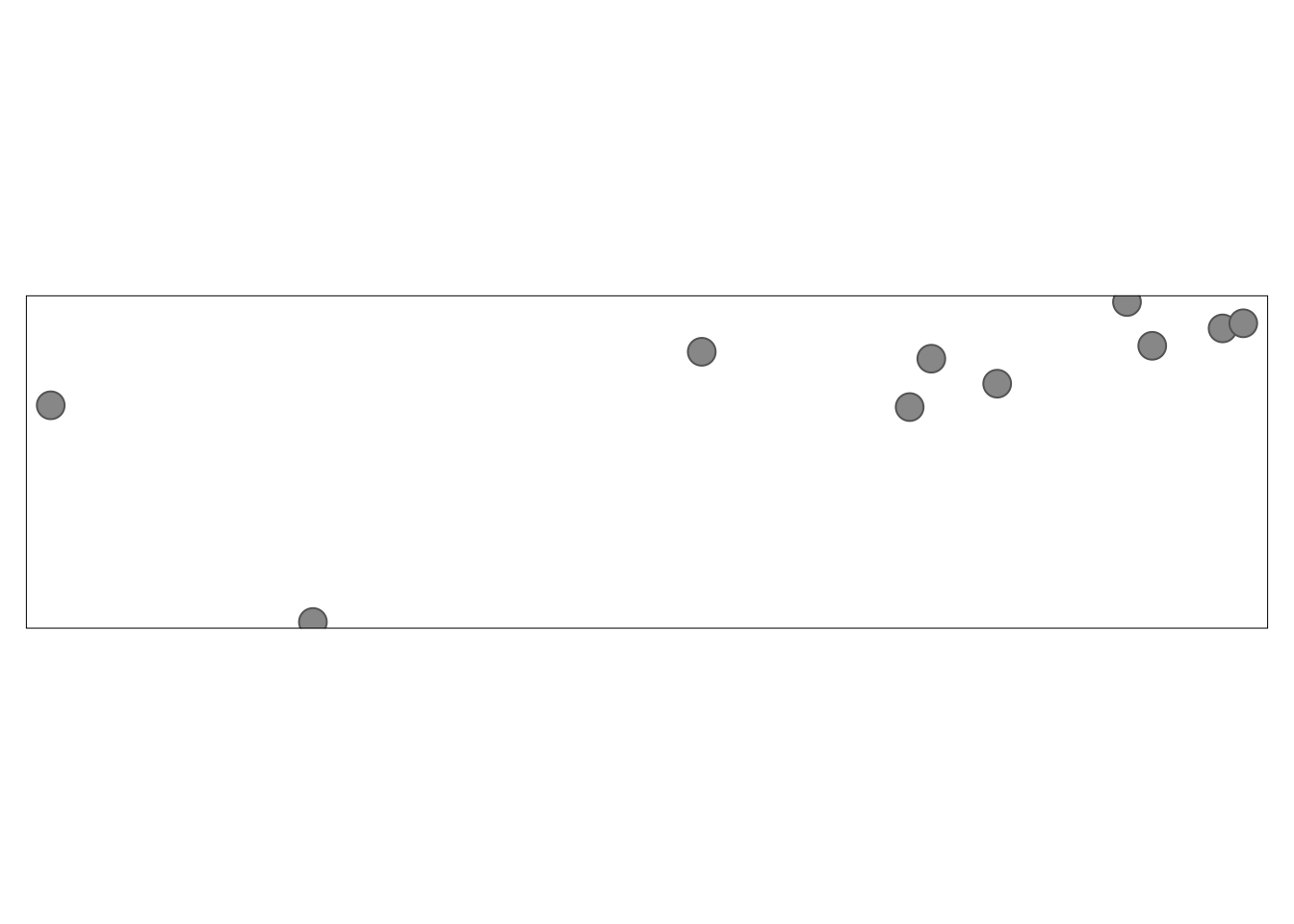
tm_symbols() has a large number of arguments to flexibly adjust how elements are displayed. While this allows adjusting its results to almost any need, it also makes this function complicated. Therefore, four additional layers are implemented in tmap: tm_squares(), tm_bubbles(), tm_dots(), tm_markers(). All of them use tm_symbols(), but with different default values.
tm_squares(): uses square symbols (shape = 22)tm_bubbles(): uses large circle symbolstm_dots(): uses small circle symbols (good for displaying many locations)tm_markers(): uses marker icons
tm_shape(world_cities) +
  tm_squares()
tm_shape(world_cities) +
  tm_bubbles()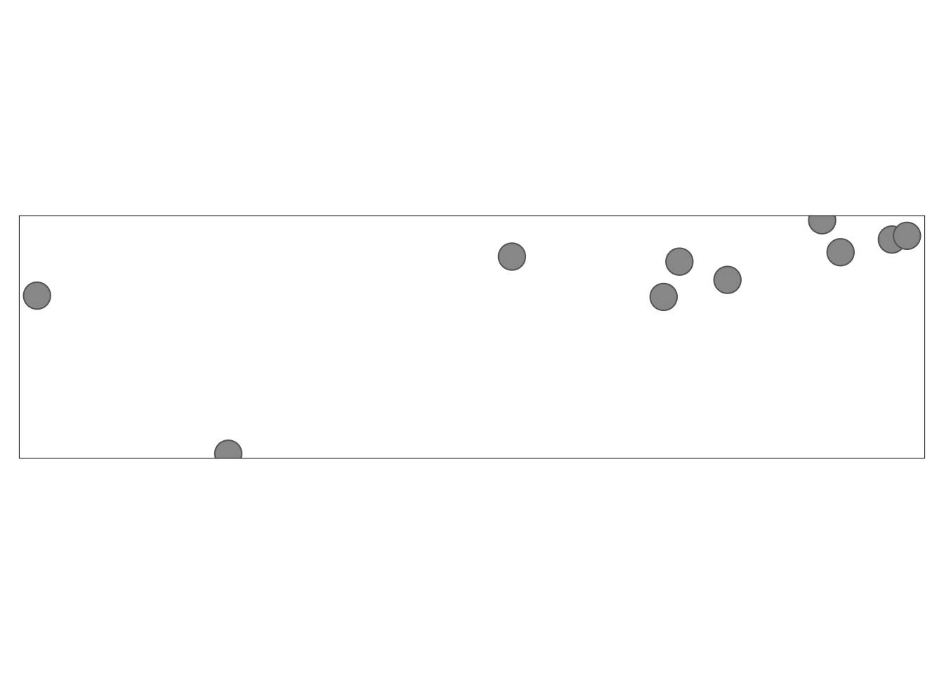
tm_shape(world_cities) +
  tm_dots()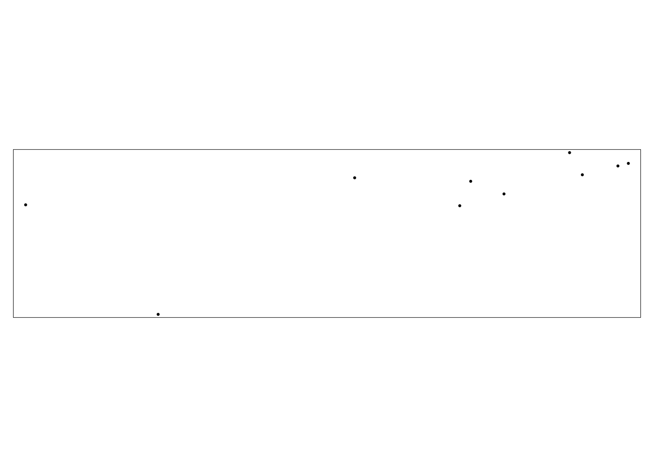
5. Visual variables
Following ggplot2 yet again, tmap uses the basic visual variables of color, size, and shape to represent data. Which variables can be applied depends on the type of the map layer.
- Symbols: color, size, and shape
- Lines: color and size
- Polygons: color
The type of data (quantitative or qualitative) also determines which visual variables can be used.
- Color: quantitative or qualitative
- Size: quantitative
- Shape: qualitative
Color
tmap uses the many ways that colors can be specified in R:
- built-in color names (e.g. “red”)
- hexadecimal (e.g. #00FF00)
- palettes
There are dozens of packages that contain hundreds of color palettes. The most popular are RColorBrewer and viridis. By default, tmap attempts to identify the type of the data being plotted and selects on of the built-in palettes.
tmap offers three main ways to specify color palettes using the palette argument:
- a vector of colors
- a palette function
- one of the built-in names
A vector of colors can be specified by name or hexidecimal. Importantly, the number of colors provided does not need to match the number of colors in the map legend. tmap automatically interpolates new colors in the case when a smaller number of colors is provided.
Just like updating axis labels, we always need to update legend titles. In tmap we can do that by updating the fill.legend argument in the attribute layer.
How would I update the legend to be on the right side of my plot instead of beneath? If you aren’t sure, check the documentation!
# vector of colors

tm_shape(world_vector) +
  tm_polygons(fill = "life_expectancy",
              fill.scale = tm_scale(values = c("yellow", "darkgreen")),
              fill.legend = tm_legend(title = "Life Expectancy (years)",
                                      position = tm_pos_out("right")))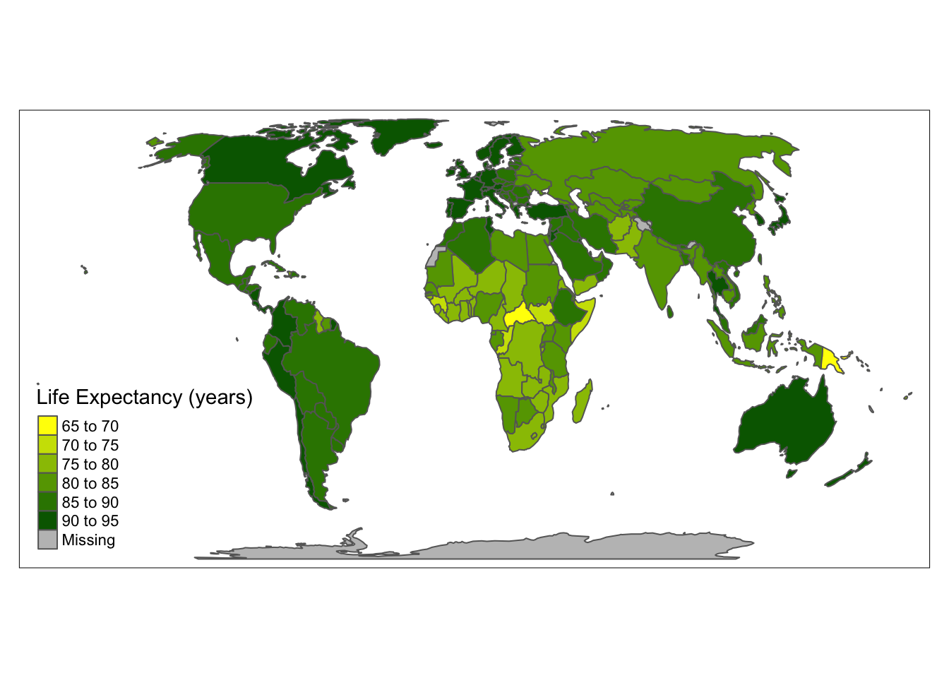
Another approach is to provide the output of a palette function. When using a palette function, you can specify the number of colors to use. Below we use the viridis palette from the viridisLite package.
#install.packages("viridisLite")
library(viridisLite)

tm_shape(world_vector) +
  tm_polygons(fill = "life_expectancy",
              fill.scale = tm_scale(values =  viridis(8)),
              fill.legend = tm_legend(title  = "Life Expectancy (years)"))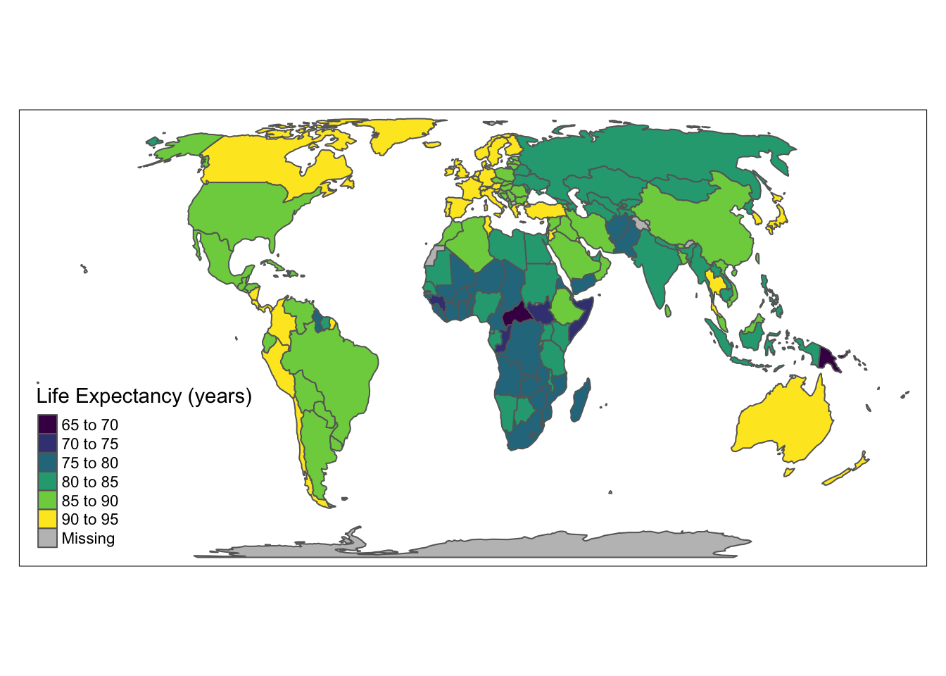
Finally, the last approach is to use the name of one of the built-in color palettes.
# built-in color palette

tm_shape(world_vector) +
  tm_polygons(fill = "life_expectancy",
              fill.scale = tm_scale(values = "brewer.yl_gn"),
              fill.legend = tm_legend(title = "Life Expectancy (years)"))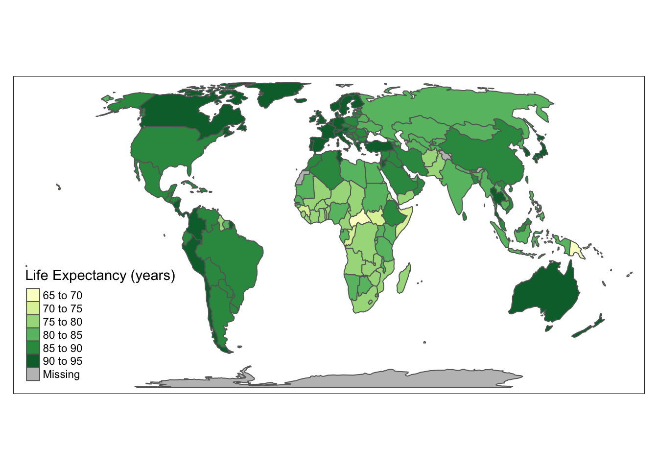
Size
Sizes can be used for points, lines (line widths), or text to represent quantitative (numerical) variables. By default, tmap represents points, lines, or text objects as the same size. The size of objects can be changed by using the size argument.
tm_shape(world_vector) +
  tm_polygons(fill = "lightblue") +
tm_shape(world_cities) +
  tm_symbols(size = "pop2020",
             size.legend = tm_legend(orientation = "portrait"))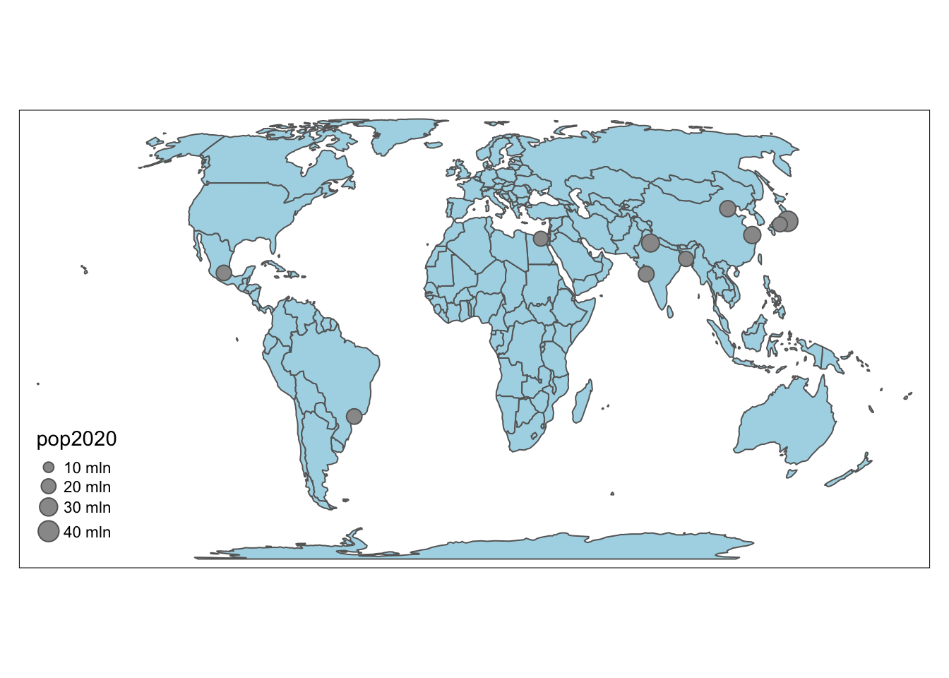
6. Layout
Just like in standard data visualizations, maps have elements that need to be provided in order to interpret them correctly. Maps need to contain either a scale bar and north arrow OR grid lines or graticules. tmap provides these elements (and others) as the following additional attribute layers.
| Function | Description |
|---|---|
| tm_grid() | draws coordinate grid lines of the coordinate system of the main shape object |
| tm_graticules() | draws latitude and longitude graticules |
| tm_scale_bar() | adds a scale bar |
| tm_compass() | adds a compass rose |
| tm_credits() | adds a text annotation |
| tm_logo() | adds a logo |
| tm_xlab() | adds an x axis labels |
| tm_ylab() | adds an y axis labels |
| tm_minimap() | adds minimap in the view mode only |
Grid lines
The tmap package offers two ways to draw coordinate lines - tm_grid() and tm_graticules(). tm_grid() represents the input data’s coordinates.
tm_shape(world_vector) +
  tm_fill() +
  tm_grid()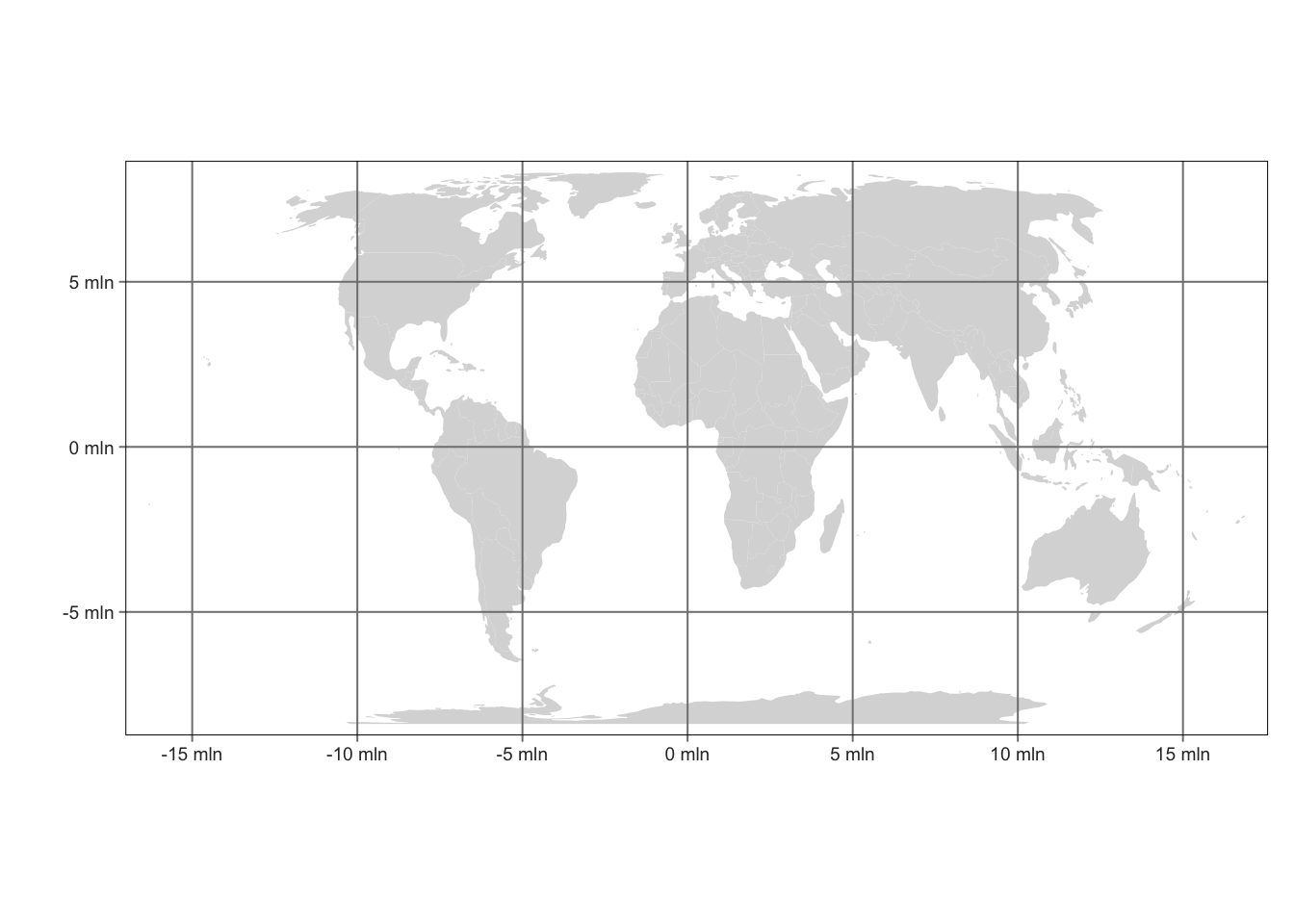
tm_graticules() shows latitude and longitude lines, with degrees as units
tm_shape(world_vector) +
  tm_fill() +
  tm_graticules()
Both tm_grid() and tm_graticules() can be placed above or below other map layers.
tm_shape(world_vector) +
  tm_graticules() + # graticules below tm_fill()
  tm_fill()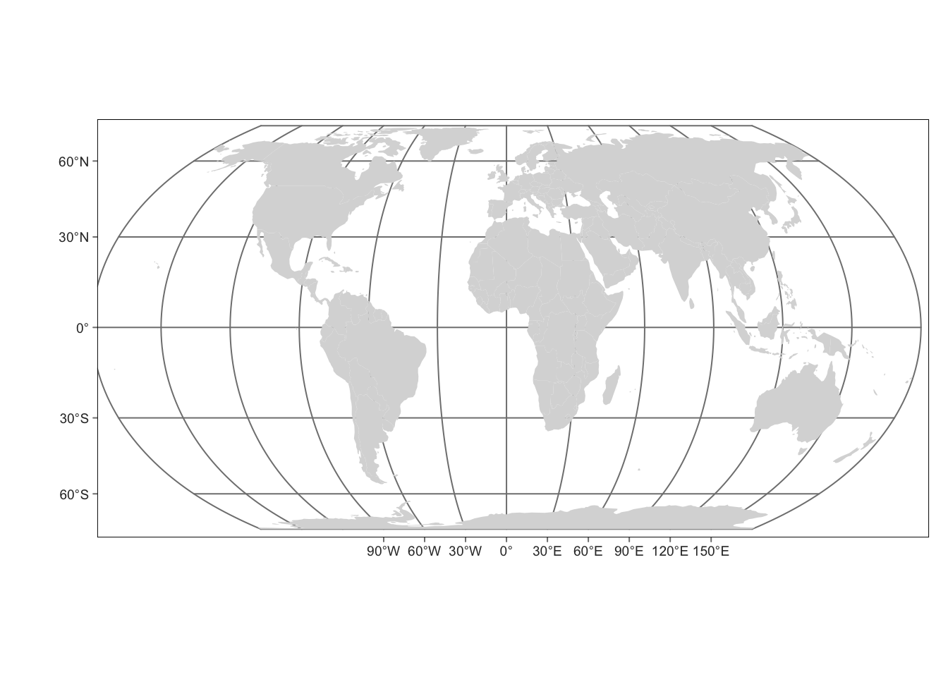
Scale bar and north arrow
A scale bar is a graphic indicator of the relation between a distance on a map and the corresponding distance in the real world. A north arrow, or a map compass or compass rose, indicates the orientation of the map. North arrows can be added to every map, but are not necessary on maps of large areas (e.g. global maps) where the orientation is obvious.
tm_shape(world_vector) +
  tm_fill() +
  tm_scalebar() +
  tm_compass(position = c("left", "top"))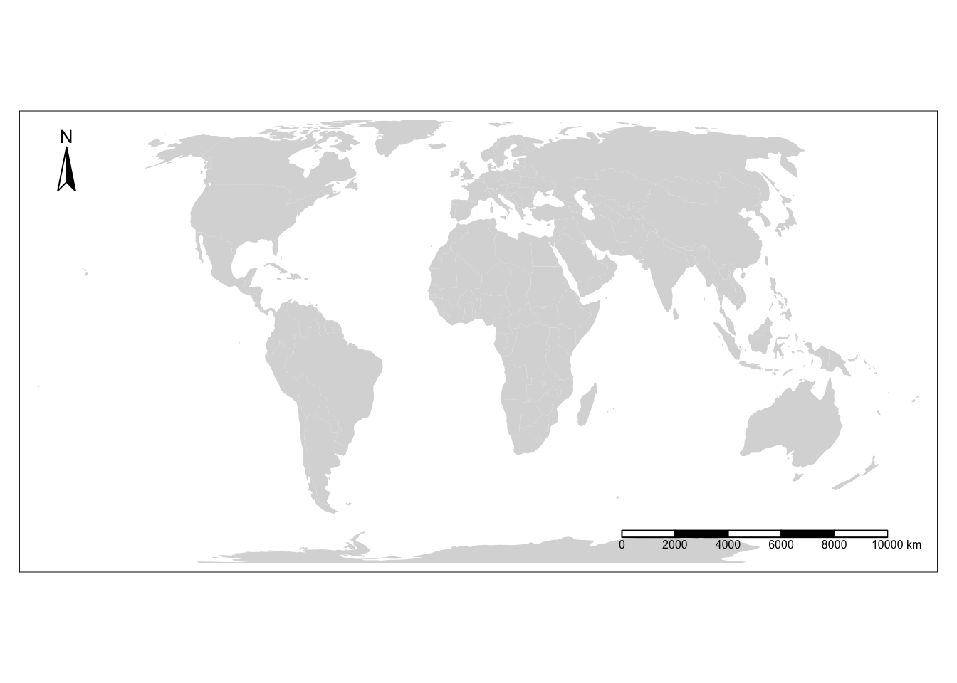
Layout options
Similar to the theme() function in ggplot2, you can control many of the map elements of the map layout.Play around with some of the different tm_layout options by checking the documentation.
tm_shape(world_vector) +
  tm_polygons(fill = "wb_income_region",
          #fill.scale = tm_scale(values = viridisLite::plasma(5)),
          fill.legend  = tm_legend(title = "Regional Income")) +
  tm_title(text = "Global income",
            frame = TRUE)+
  tm_layout(text.fontfamily = "Montserrat",
            style= "beaver",
            bg.color = "grey95")
Warning in graphics::strwidth(comp$title, units = "inch", cex = titleS, : no
font could be found for family "Montserrat"Warning in graphics::strwidth(comp$labels, units = "inch", cex = textS, : no
font could be found for family "Montserrat"
Warning in graphics::strwidth(comp$labels, units = "inch", cex = textS, : no
font could be found for family "Montserrat"
Warning in graphics::strwidth(comp$labels, units = "inch", cex = textS, : no
font could be found for family "Montserrat"
Warning in graphics::strwidth(comp$labels, units = "inch", cex = textS, : no
font could be found for family "Montserrat"
Warning in graphics::strwidth(comp$labels, units = "inch", cex = textS, : no
font could be found for family "Montserrat"Warning in graphics::strwidth(comp$text, units = "inch", family =
comp$fontfamily, : no font could be found for family "Montserrat"Warning in graphics::strwidth(comp$labels, units = "inch", cex = textS, : no
font could be found for family "Montserrat"
Warning in graphics::strwidth(comp$labels, units = "inch", cex = textS, : no
font could be found for family "Montserrat"
Warning in graphics::strwidth(comp$labels, units = "inch", cex = textS, : no
font could be found for family "Montserrat"
Warning in graphics::strwidth(comp$labels, units = "inch", cex = textS, : no
font could be found for family "Montserrat"
Warning in graphics::strwidth(comp$labels, units = "inch", cex = textS, : no
font could be found for family "Montserrat"Warning in grid.Call.graphics(C_text, as.graphicsAnnot(x$label), x$x, x$y, : no
font could be found for family "Montserrat"
Warning in grid.Call.graphics(C_text, as.graphicsAnnot(x$label), x$x, x$y, : no
font could be found for family "Montserrat"
Warning in grid.Call.graphics(C_text, as.graphicsAnnot(x$label), x$x, x$y, : no
font could be found for family "Montserrat"
Warning in grid.Call.graphics(C_text, as.graphicsAnnot(x$label), x$x, x$y, : no
font could be found for family "Montserrat"
Warning in grid.Call.graphics(C_text, as.graphicsAnnot(x$label), x$x, x$y, : no
font could be found for family "Montserrat"
Warning in grid.Call.graphics(C_text, as.graphicsAnnot(x$label), x$x, x$y, : no
font could be found for family "Montserrat"
Warning in grid.Call.graphics(C_text, as.graphicsAnnot(x$label), x$x, x$y, : no
font could be found for family "Montserrat"
Warning in grid.Call.graphics(C_text, as.graphicsAnnot(x$label), x$x, x$y, : no
font could be found for family "Montserrat"
Warning in grid.Call.graphics(C_text, as.graphicsAnnot(x$label), x$x, x$y, : no
font could be found for family "Montserrat"
Warning in grid.Call.graphics(C_text, as.graphicsAnnot(x$label), x$x, x$y, : no
font could be found for family "Montserrat"
Warning in grid.Call.graphics(C_text, as.graphicsAnnot(x$label), x$x, x$y, : no
font could be found for family "Montserrat"
Warning in grid.Call.graphics(C_text, as.graphicsAnnot(x$label), x$x, x$y, : no
font could be found for family "Montserrat"
Warning in grid.Call.graphics(C_text, as.graphicsAnnot(x$label), x$x, x$y, : no
font could be found for family "Montserrat"
Warning in grid.Call.graphics(C_text, as.graphicsAnnot(x$label), x$x, x$y, : no
font could be found for family "Montserrat"
Warning in grid.Call.graphics(C_text, as.graphicsAnnot(x$label), x$x, x$y, : no
font could be found for family "Montserrat"
Warning in grid.Call.graphics(C_text, as.graphicsAnnot(x$label), x$x, x$y, : no
font could be found for family "Montserrat"
Warning in grid.Call.graphics(C_text, as.graphicsAnnot(x$label), x$x, x$y, : no
font could be found for family "Montserrat"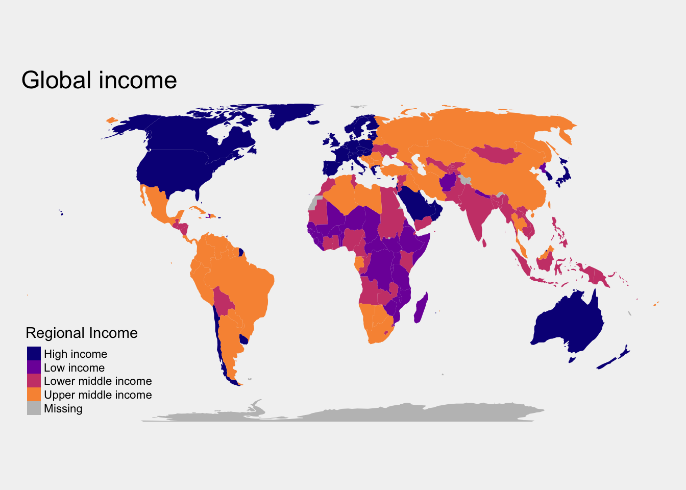
7. Interactive options
One of the most powerful aspects of tmap is the ease of creating interactive maps. tmap has two modes "plot" which creates static maps and "view" which creates interactive maps that can be easily embedded in quarto docs. It’s as easy as using the tmap_mode()!
tmap_mode("view")ℹ tmap mode set to "view".tm_shape(world_vector) +
tm_polygons(fill = "gdp_per_cap",
fill.legend = tm_legend(title = "GDP per capita")) To return to regular plotting mode, simply reset tmap_mode.
tmap_mode("plot")ℹ tmap mode set to "plot".8. Saving maps
Maps can be stored as objects for for adding additional layers and saving programmatically. Maps can be saved directly in tmap using the tmap_save() function.
map1 <- tm_shape(world_vector) +
  tm_polygons(fill = "life_expectancy",
              fill.scale = tm_scale(values =  viridis(8)),
              fill.legend = tm_legend(title  = "Life Expectancy (years)"))

tmap_save(map1, here("tmap-example.png"))